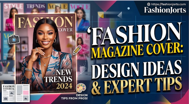
A fashion magazine cover has a difficult job. It needs to catch the eye without becoming noisy, introduce the personality of the publication, and give readers a reason to open the issue. Photography may take center stage, but the final impression depends just as much on typography, styling, spacing, and composition. The most effective covers feel intentional. The model, clothing, background, magazine name, and headlines appear to belong together rather than looking like separate pieces placed on a page. Whether you’re designing a luxury publication, student project, independent editorial, or digital magazine, understanding that relationship is the best place to start.
What Is a Fashion Magazine Cover?
A fashion magazine cover is the front page that introduces an issue and its editorial direction. It commonly features a model, celebrity, designer, or fashion-focused photograph alongside the publication’s name and selected story headlines. Unlike an ordinary poster, the cover also needs to represent a continuing brand. Readers should be able to recognize the magazine while still seeing something fresh from one issue to the next. This balance between consistency and change is one reason cover design requires careful planning.
What Makes a Good Fashion Magazine Cover?
A successful cover gives the eye a clear place to begin. The subject might command attention first, followed by the magazine title and then the main story. That visual order prevents readers from having to work out what matters. Good design also knows when to stop. Filling every available space with text rarely makes an issue more appealing. A carefully chosen photograph with a few well-positioned headlines can communicate far more than a crowded page filled with competing messages. The cover should also match the publication. A luxury title may favor elegant portraiture and restrained text, while an independent streetwear magazine can use unconventional framing and bolder type. Neither approach is automatically better; the right choice is the one that reflects the audience and editorial character.
Essential Elements of a Fashion Magazine Cover
Masthead and Magazine Name
The masthead gives the publication its identity. It normally appears near the top and should remain recognizable across different issues, even when photographs, colors, and themes change. Designers sometimes place a model partly in front of the masthead to create depth. This works best when the publication name remains easy to recognize. For a new magazine, keeping more of the title visible is usually the safer choice.
Main Cover Image
The photograph carries much of the cover’s personality. Expression, pose, wardrobe, lighting, and background all influence whether the result feels luxurious, youthful, dramatic, relaxed, or experimental. Composition matters just as much as image quality. A photograph that leaves usable space around the subject makes headline placement easier and reduces clutter. Planning that space during the photoshoot often produces a cleaner result than trying to manufacture it afterward.
Headlines and Cover Lines
Cover lines give readers a glimpse of the stories inside. The most important story deserves stronger visual treatment, while secondary subjects can appear in smaller type. Short, specific wording usually works better than long explanations. A headline should create interest without becoming vague or exaggerated. Its purpose is to help sell the story, not compete with the photograph.
Typography and Font Choices
Typography can change the entire character of a cover. Elegant serif lettering can suit classic or luxury styling, while simple sans-serif type often feels modern and direct. Too many font families can quickly weaken the design. A small, carefully controlled type system creates consistency and makes hierarchy easier to understand. Size, weight, spacing, and placement can provide variety without introducing a new font for every headline.
Colors and White Space
Cover colors should respond to the photograph rather than being selected separately. Designers can pull tones from clothing, makeup, accessories, or the background to create a connected visual identity. Empty space is equally valuable. Giving the model and headlines room to breathe can make a design feel more confident. White space doesn’t have to be literally white; it simply means areas that aren’t overloaded with competing information.
Fashion Magazine Cover Design Ideas
Minimalist Fashion Magazine Cover
Minimalist covers rely on restraint. A strong portrait, recognizable masthead, limited color palette, and one or two carefully positioned headlines may be enough. This style works especially well when the photography has a distinctive mood. With fewer elements available, however, every choice becomes more noticeable. Weak cropping or poor typography can’t hide behind decoration.
Luxury Fashion Magazine Cover
Luxury styling often depends on controlled photography rather than flashy effects. Refined clothing, jewelry, deliberate posing, careful lighting, and sophisticated type can establish a premium feel. The mistake is assuming luxury means adding gold text, decorative borders, or elaborate fonts everywhere. Expensive-looking editorial design is often quieter. Confidence comes from strong materials and disciplined composition.
Vintage Fashion Magazine Cover
A vintage direction can borrow visual cues from earlier publishing periods without becoming a direct copy. Illustration, restrained colors, classic portraiture, period-inspired typography, or subtle photographic texture can establish the mood. The historical reference should still feel intentional. Combining unrelated retro elements from several decades can produce something closer to costume than editorial design. Choosing one clear period or visual influence creates a more convincing result.
Black and White Fashion Cover
Removing color puts greater attention on shape, expression, texture, and lighting. Black-and-white portraits can work particularly well for beauty features, designer profiles, and dramatic editorial concepts. Typography becomes especially important in these compositions. Neutral lettering maintains the monochrome character, while a single contrasting accent can draw attention to one important story without overwhelming the photograph.
High-Fashion Editorial Cover
High-fashion covers have more freedom to experiment. Dramatic poses, unusual styling, couture clothing, architectural settings, strong makeup, and unexpected crops can all become part of the concept. Experimentation still needs direction. An unusual image should communicate an idea rather than simply look strange. The strongest editorial photographs make the viewer curious while preserving enough clarity to function as a cover.
How to Design a Fashion Magazine Cover
Begin with the issue’s central idea. Decide what the publication is saying and who or what deserves the most attention before choosing fonts, colors, or decorative elements. This keeps design decisions tied to editorial purpose. Next, select an image that works with text rather than against it. Establish the masthead, position the main headline, and then add secondary information according to importance. Check contrast carefully so words remain readable over both light and dark areas of the photograph. Finally, remove anything that isn’t helping. This stage is easy to overlook, but editing is often what separates a polished layout from an amateur one. If a line, shape, color, or additional headline doesn’t improve communication, it probably doesn’t need to stay.
Choosing the Right Photo for a Magazine Cover
Resolution is only the starting point. The image needs a strong focal point, appropriate framing, and enough flexibility for the final layout. A technically excellent photograph can still be a poor cover choice if every corner is visually busy. Think about where text will sit before committing to an image. Hair, patterned clothing, architecture, and strong highlights can make lettering difficult to read. Areas with simpler tones give designers more freedom without requiring heavy shadows or artificial text boxes. The subject’s expression should also support the story. Direct eye contact can feel confident and immediate, while looking away may produce a quieter editorial mood. There is no mandatory pose; the image simply needs to support the character of the issue.
Best Fonts for Fashion Magazine Covers
Fashion publishing isn’t limited to a particular font category. Serif typefaces can communicate heritage and refinement, while geometric or neutral sans-serif fonts can create a cleaner contemporary appearance. Display type can work for special themes when readability remains intact. Instead of searching for a single “fashion font,” consider how the complete type system behaves. The masthead needs personality, the primary headline needs emphasis, and smaller lines need clarity. Those roles can often be handled effectively with one or two compatible font families.
Fashion Magazine Cover Size and Print Requirements
Magazine dimensions vary between publishers and printers, so there isn’t one correct size for every project. A designer preparing physical copies should confirm the final trim dimensions, bleed, safe area, color requirements, and image specifications before exporting artwork. Digital covers have different demands. They frequently appear as small thumbnails on websites and mobile screens, where fine details and tiny headlines can disappear. Testing the design at several sizes helps reveal problems before publication.
Conclusion
A fashion magazine cover works best when it has a clear editorial idea. Photography may attract the first glance, but typography, composition, styling, and spacing determine whether the design feels coherent once someone looks closer. There is plenty of room for creativity. A cover can be minimalist, glamorous, monochrome, vintage-inspired, or deliberately experimental without losing its purpose. What matters is that the visual choices belong to the same story. For new designers, restraint is a useful discipline. Start with the photograph and the most important message, then build around them instead of filling the page first and editing later. Before publishing, view the finished cover from a distance and at thumbnail size. If the subject, magazine identity, and main story are still immediately clear, the design is ready to do what a good cover should: make someone want to see what comes next.